In Excel 2010, line charts can display continuous data over time, set against a common scale, and are therefore ideal for showing trends in data at equal intervals. In a line chart, category data is distributed evenly along the horizontal axis, and all value data is distributed evenly along the vertical axis.
You should use a line chart if your category labels are text, and represent evenly spaced values such as days, months, quarters, or years. Line charts are especially useful for displaying multiple series. If you have only one series, you should consider using a scatter chart. Also, you might want to use a scatter chart if you have more than ten numeric labels.
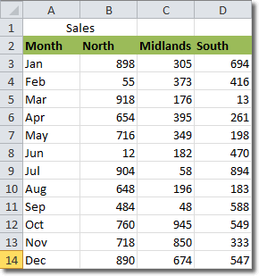
Let’s look at an example. Here we have a spreadsheet containing sales figures by month for three different regions: the North, Midlands and South.

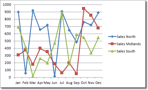
Notice that the “timeline” has been entered into the left hand column while each data series (for each region) has been entered into subsequent columns. To create a line chart, select all the data and the column headings. Click Insert > Charts > Line, and select a chart type. I selected Line with Markers to produce this line chart:

Because we selected the column headings, they appear in the chart’s legend to the right.
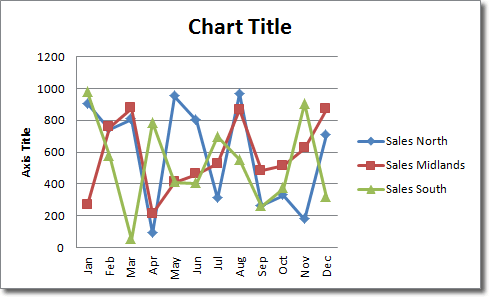
The x-axis labels displaying the months looks a little cramped, so let’s display them at an angle. With the chart selected, click Chart Tools > Design > Chart Layouts > Layout 1 (the first option).

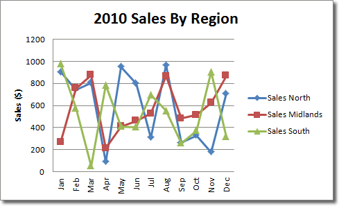
Also, we need to give the chart a title and label the y-axis. To change the title, click into the title text box and select all the text. Type in something meaningful for this line chart, such as “2010 Sales By Region”. We update the y-axis label in a similar way: click into that text box, select the text by dragging over it and then type something like “sales ($)”. This is the end result.


