A scatter chart plots the values for two variables as a set of points on a graph. One variable controls the position on the x-axis of a point, whilst the other variable controls the position on the y-axis. If you’re familiar with graphs, you might already understand that these points are referred to as (x,y) where x is the position along the x-axis and y is the position along the y-axis of each point.
Whereas in a line chart the x-axis represents different categories, in a scatter chart it represents the actual values of the variable. Scatter charts are best understood by looking at examples. Here is some sample data that suggests that there is a relationship between the number of years people spend in education and their salaries.
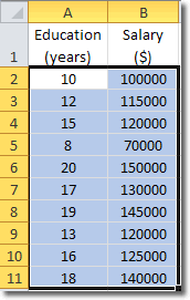
It’s hard to see what’s going on when we look at raw numbers, so why don’t we use them to create a scatter chart?
Select all the cells that contain data and then click Insert > Charts > Scatter, and choose one of the scatter charts. I chose Scatter with only Markers.
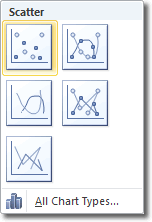
The scatter diagram, even in its current state shows us that there is a possible relationship between years in education and salary. Here is the scatter chart I created:
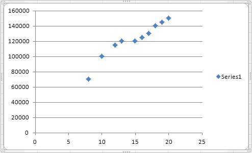
You can see that as years in education increases, so does salary. But we can make this relationship even clearer by using trendlines.
Using Trendlines In Scatter Charts
Trendlines mark out the trend in the data. To display a trendline in our scatter chart, click Chart Tools > Layout > Analysis > Trendline. In the Trendline panel that opens, Linear Trendline is probably our best option, so choose that.
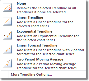
Adding a trendline to a scatter chart is a good way of visually representing the underlying trend in the data.
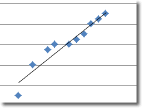
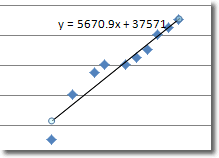
This trendline helps us understand the data better, but we can add more useful information. The trendline represents a linear equation (remember that we chose linear trendline) and we can see that equation displayed on the chart, if we play our cards right.
With the chart selected, click on the Trendline button again (Chart Tools > Layout > Analysis > Trendline > More Trendline Options).
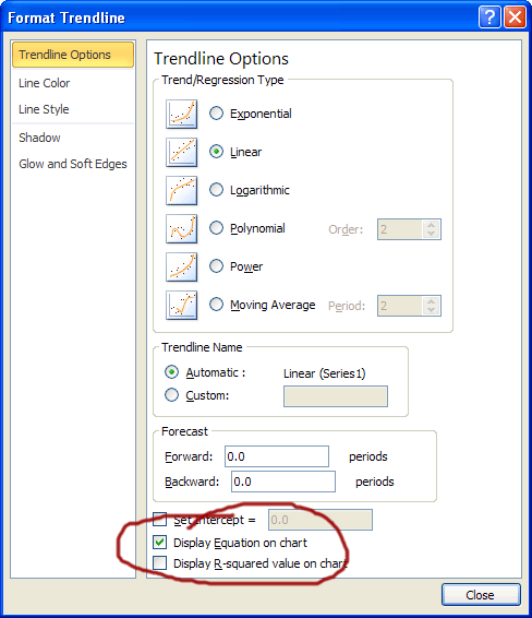
The Format Trendline window that open is pretty big, but there’s only one option we need here: Display Equation on Chart. Ensure that there is a check in that checkbox and click close. You will then see a linear equation of the form
y = ax + b
A bit like this:
